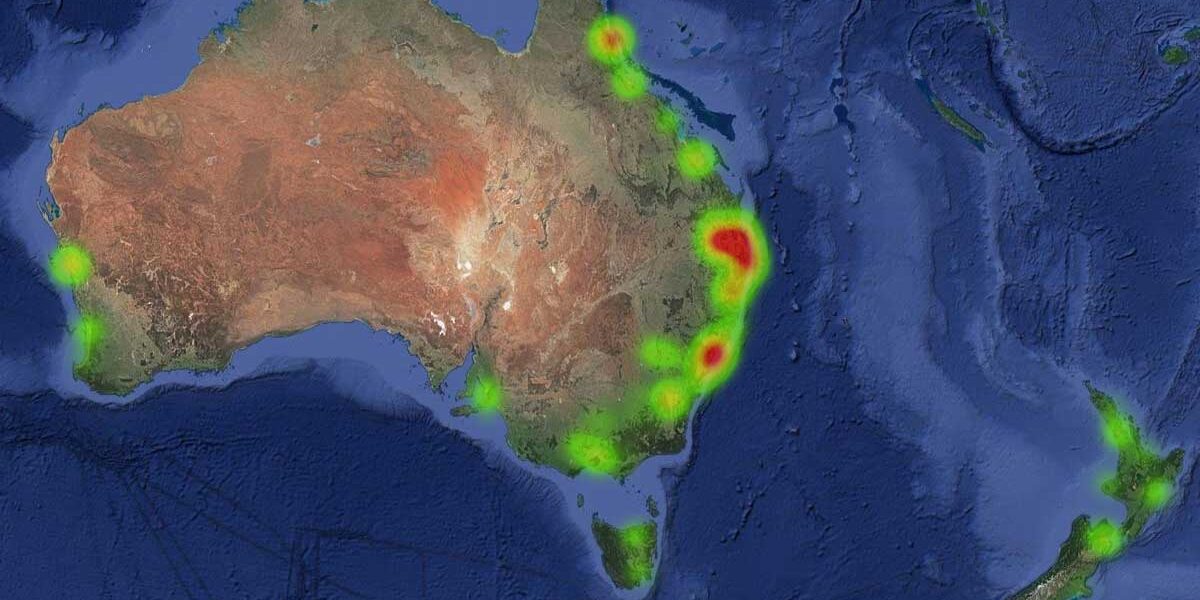
Author’s Note: This post discusses the new reports & mapping server based on the SCARD Research Pool and was originally posted on https://scard.co/. You can check out the maps and results at https://report.scard.co/.
Lights in a dark room
“Through the lens of dermoscopy, we can delve deep into the skin’s intricacies, revealing crucial details that can lead to early detection and precise diagnosis of skin conditions.
In turn, visualizing data is like turning on the lights in a dark room; it unveils patterns, trends, and insights that might otherwise remain hidden.”
– Tobias @ SCARD
In the realm of medical practice and research, the significance of data analysis cannot be overstated. Medical professionals constantly grapple with a wealth of patient information, but the manner in which they digest and utilize this data can have a profound impact on decision-making and patient outcomes.
One critical consideration in this process is the choice between raw statistics and visual data representation, such as graphs and charts. To assist all health care professionals, SCARD Systems have just released our updated report platform for public data, including heat maps and reports from the SCARD Research Pool.
Collating the data from raw results
When we’re dealing with complex medical information, just looking at raw statistics can be pretty overwhelming. These numbers give us a lot of details about things like patient information, test results, and how treatments are working. But sometimes, there’s so much data that it’s tough to see the big picture – like finding trends, unusual cases, or important connections quickly. This is where graphs and charts come in handy. They take all those complicated numbers and turn them into easy-to-understand pictures, so healthcare professionals can see what’s going on at a glance. These visual tools help turn numbers into practical insights, making it easier for doctors to make fast, smart decisions about how to treat skin cancer.
Plus, using statistics lets them compare different treatments, which is super helpful for finding the best ways to treat different kinds and stages of skin cancer. Digging deep into the statistics of various skin cancer procedures helps doctors keep improving how they take care of patients. They can give people the best, most personalized care possible. But there’s a balance to strike: the data has to be clear and useful, without revealing personal patient info to protect privacy while still making sure everyone understands what’s happening.
The emphasis on privacy
When we’re sharing audit reports with the public, one of the most important things is protecting the privacy of everyone involved. To do this, we follow a careful process called deidentification. It’s a step-by-step method that takes out any information that could be used to figure out who individual patients are while keeping the important stuff we need for studying the data.
First and foremost, all personally identifiable information, such as names, addresses, dates of birth, and other details are systematically removed from the research pool. This process is complemented by the aggregation of data, ensuring that specific demographics cannot be discerned. Additionally, any other potentially identifying details, like unique medical record numbers or specific procedural dates, are either replaced with anonymous identifiers or transformed to obscure their original meaning. This anonymization process extends to all elements within the report, including locations down to the aggregated postcode for the area.
Reports Server
You can check out the maps and results at https://report.scard.co/


